Regency Curves & Rectangles
by robertmcnicol
Nothing too massively surprising here today. Two of the most familiar sights of the Hove seafront are Adelaide Crescent and Brunswick Square, which – if you include Brunswick Terrace – sit right next to each other vying for attention. In the eponymous cream corner we have Brunswick Square, with a fanciful mixture of detail – giant Ionic order articulated columns, giant Corinthian order pilasters, Doric columns on the ground floor, a fussy mixture of bays of differing depths, balustrades, balconies, pediments… you know the sort of thing. All very nice.
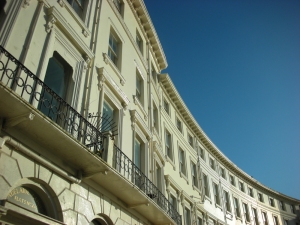
In the off-white corner we have Adelaide Crescent, which does things in a much more restrained fashion in order to basically draw attention to the beautiful reflected ogee curves that constitute the fundamental form and finest quality of the crescent. Like this:
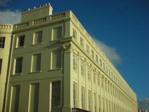
So there we have it – Adelaide Crescent* is mainly all about the shape and structure of the buildings as a whole; it’s a step toward the restraint and more formal Classicism of the Victorian revivalist era. Brunswick Square is mainly about the cornucopia of detail; it’s classic Regency. Except, here is Brunswick Terrace, sitting heavy and massive, a big weighty rectangle of stuccoed brick, which I hadn’t really noticed it in this way before. What am I trying to say here? Well, I guess that architecture isn’t as clearly definable as we might at first think.
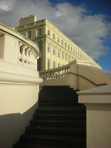
Oh, and as they’re right next to each other, you get this, which is nice:
*So I’d like to mention that the architect for Adelaide Crescent was a Mr. Decimus Burton, who surely has the finest name of all English architects. Decimus. I’m just saying, if you have nine kids and one on the way then give it some consideration, eh?


